Here are some graphs about the evolution of prices through time.
Insights Ibov
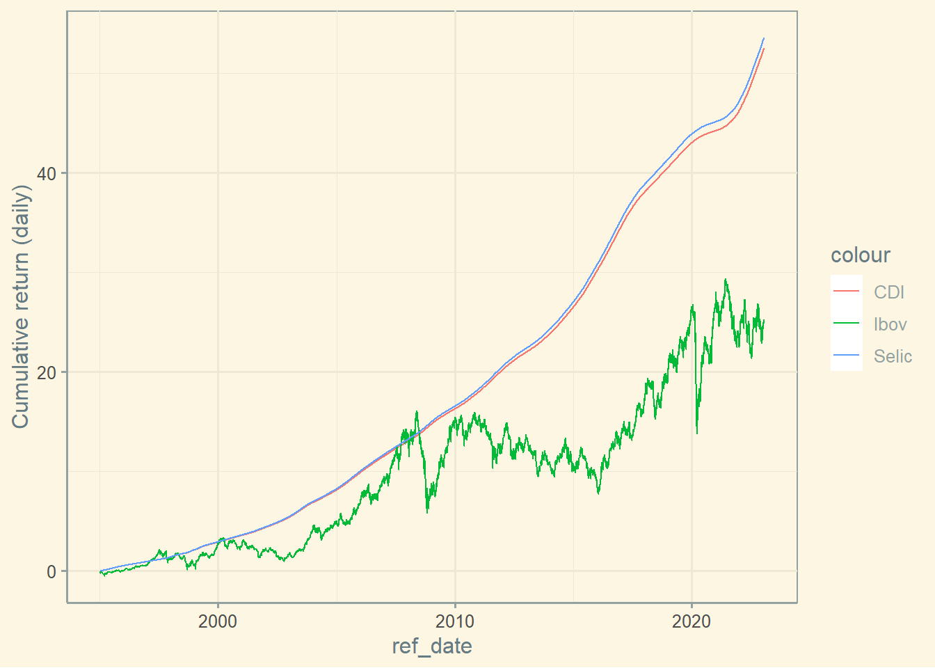
Ibov vs CDI vs Selic in Brazil
#### QUANDL API # Step to create your key # 1. Go to https://www.quandl.com/ # 2. Create an account # 3. Get your key # 4. Add your key below (I can't give you mine) library (yfR)library (ggplot2)library (GetQuandlData)library (PerformanceAnalytics)library (ggthemes)library (roll)library (readxl)library (tidyr)library (dplyr)<- "Your QUANDL API KEY here" #Ibov <- '^BVSP' <- '1995-01-01' <- Sys.Date () <- yf_get (tickers = stock, first_date = start,last_date = end)<- ibov[order (as.numeric (ibov$ ref_date)),]# Cumulative return Ibov $ Ibov_return <- ibov$ cumret_adjusted_prices - 1 #Selic <- get_Quandl_series (id_in = c ('Selic' = 'BCB/11' ),api_key = api_key, first_date = start,last_date = end)<- selic[order (as.numeric (selic$ ref_date)),]$ value <- selic$ value / 100 # Cumulative return Selic <- data.frame (nrow (selic): 1 )colnames (return_selic)<- "selic_return" for (i in (2 : nrow (selic))) {1 ] <- Return.cumulative ( selic$ value[1 : i] )# CDI <- get_Quandl_series (id_in = c ('CDI' = 'BCB/12' ), api_key = api_key , first_date = start ,last_date = end)<- cdi[order (as.numeric (cdi$ ref_date)),]$ value <- cdi$ value / 100 # Cumulative return CDI <- data.frame (nrow (cdi): 1 )colnames (return_CDI)<- "CDI_return" for (i in (2 : nrow (cdi))) {1 ] <- Return.cumulative ( cdi$ value[1 : i] )#Inflation Brazil <- get_Quandl_series (id_in = c ('Inflation' = 'BCB/433' ),api_key = api_key, first_date = start,last_date = end)<- inf[order (as.numeric (inf$ ref_date)),]$ value <- inf$ value / 100 # Cumulative return Inflation <- data.frame (nrow (inf): 1 )colnames (return_Inf)<- "Inflation_return" for (i in (2 : nrow (inf))) {1 ] <- Return.cumulative ( inf$ value[1 : i] )# Merging dataframes <- cbind (selic, return_selic)<- cbind (cdi, return_CDI)<- cbind (inf, return_Inf)<- merge (cdi ,selic, by= c ("ref_date" ))<- merge (df ,ibov, by= c ("ref_date" ))<- merge (df ,inf, by= c ("ref_date" ))$ selic_return[1 ] <- NA $ CDI_return[1 ] <- NA $ Ibov_return[1 ] <- NA $ Inflation_return[1 ] <- NA # Graph cumulated return CDI and IBOV ggplot (df, aes (ref_date)) + geom_line (aes (y = CDI_return, color = "CDI" )) + geom_line (aes (y = Ibov_return, colour = "Ibov" )) + geom_line (aes (y = selic_return, colour = "Selic" )) + labs (y= 'Cumulative return (daily)' ) + theme_solarized ()
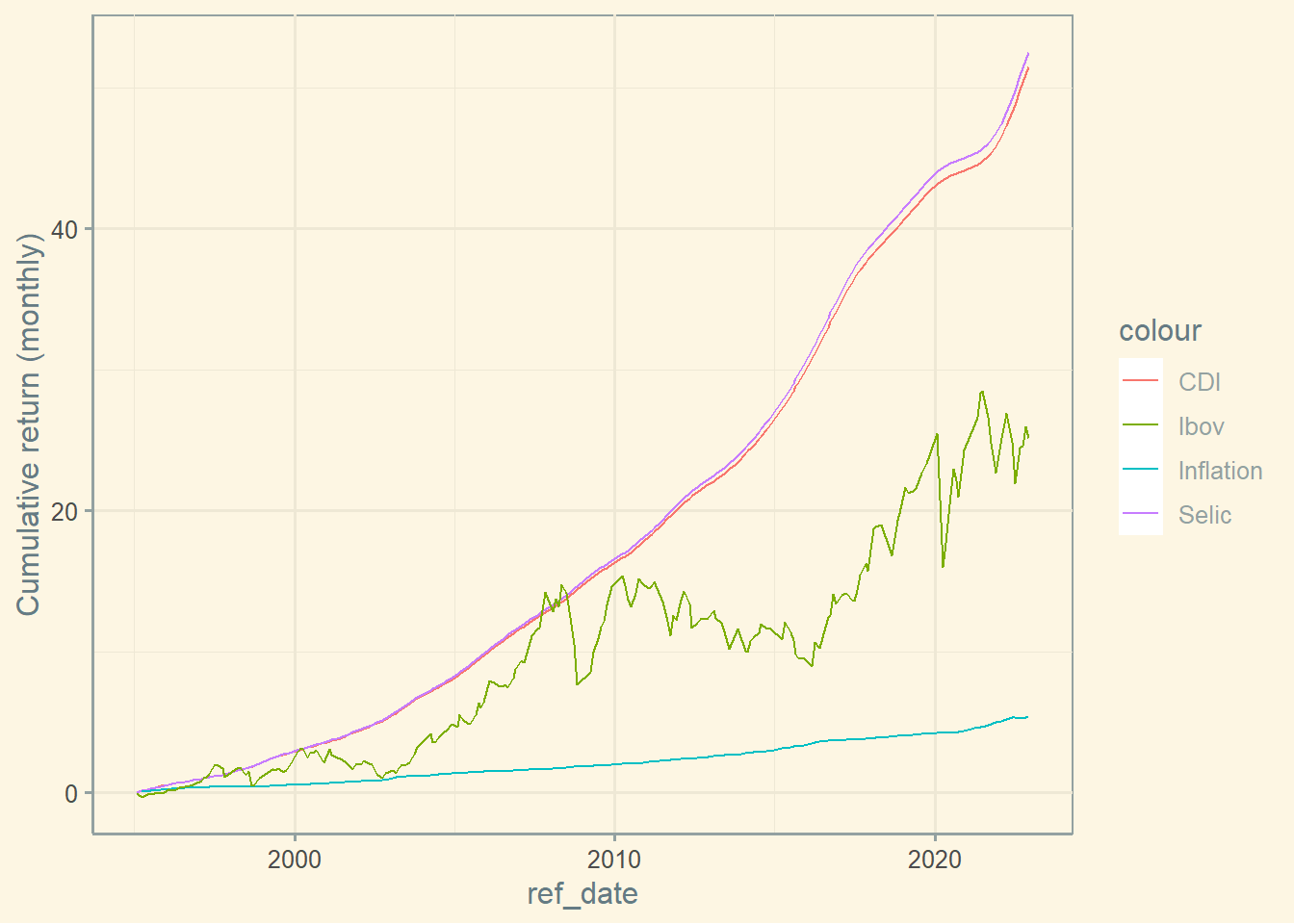
Ibov vs CDI Vs. Selic vs. Inflation in Brazil
# Graph cumulated return CDI, IBOV, and Inflation ggplot (df2, aes (ref_date)) + geom_line (aes (y = CDI_return, colour = "CDI" )) + geom_line (aes (y = selic_return, colour = "Selic" )) + geom_line (aes (y = Inflation_return, colour = "Inflation" )) + geom_line (aes (y = Ibov_return, colour = "Ibov" )) + labs ( y= 'Cumulative return (monthly)' ) + theme_solarized ()
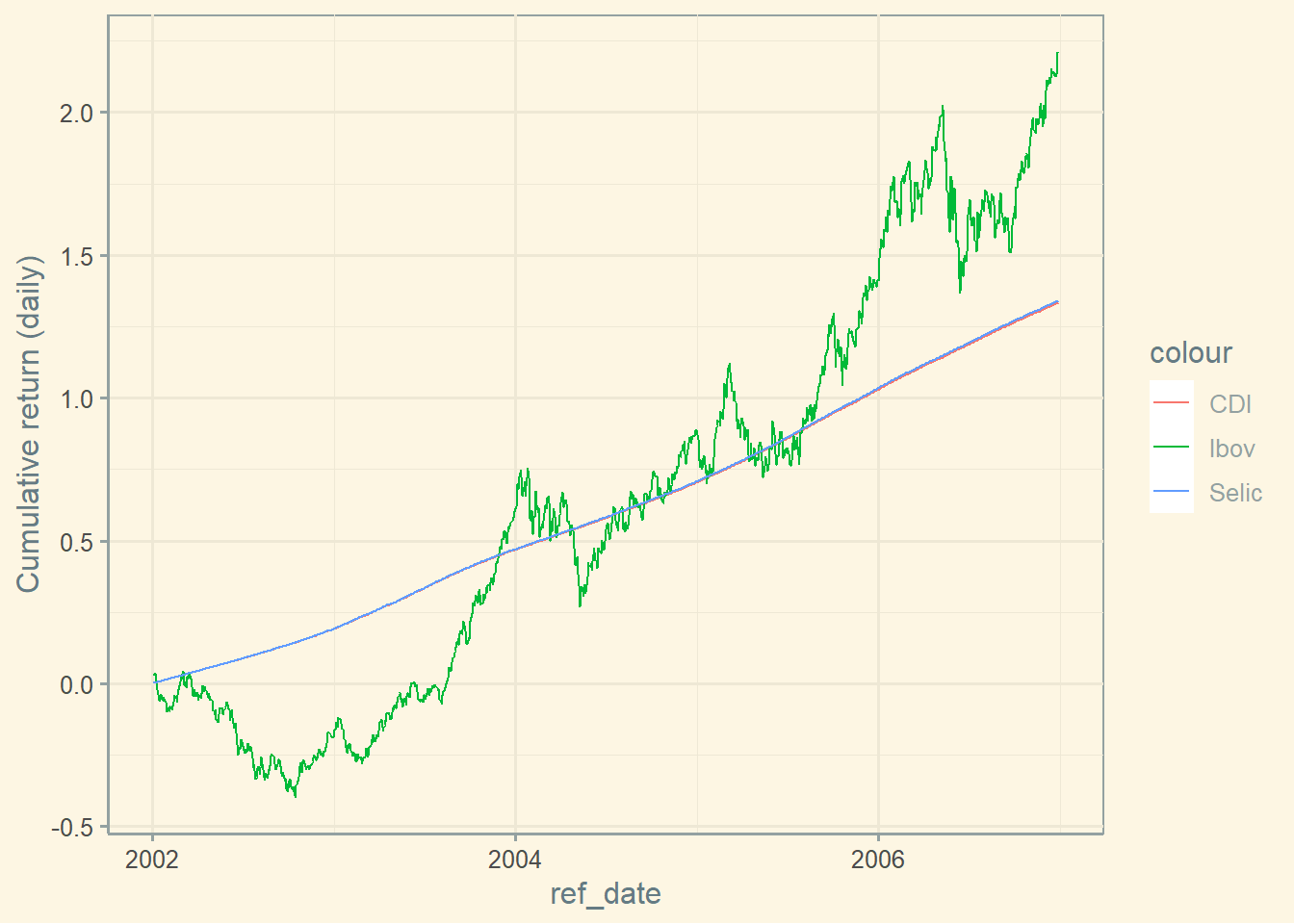
Ibov vs CDI vs Selic in Brazil 2002-2007
# Graph cumulated return CDI and IBOV #| label: insights_4 ggplot (df, aes (ref_date)) + geom_line (aes (y = CDI_return, colour = "CDI" )) + geom_line (aes (y = Ibov_return, colour = "Ibov" )) + geom_line (aes (y = selic_return, colour = "Selic" )) + labs (y= 'Cumulative return (daily)' ) + theme_solarized ()
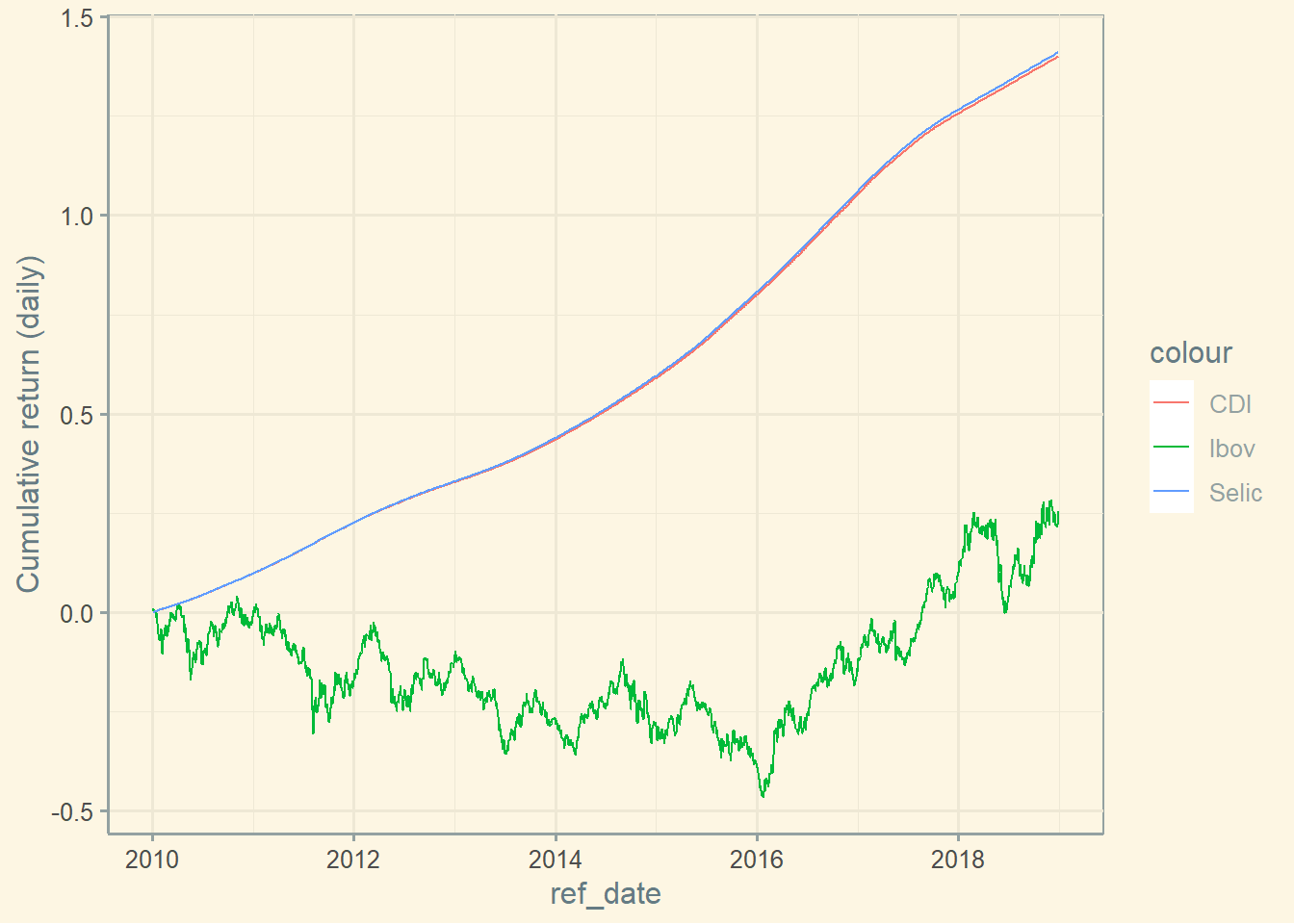
Ibov vs CDI vs Selic in Brazil 2010-2019
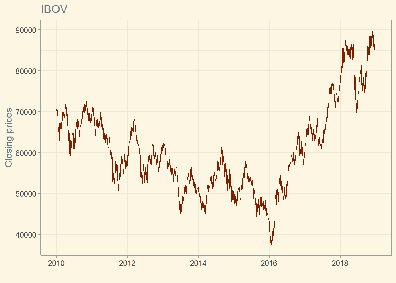
Closing prices
ggplot (ibov,aes (ibov$ ref_date, ibov$ price_close))+ geom_line (color= '#801e00' ) + labs (x = "" , y= 'Closing prices' , title= "IBOV" ) + theme_solarized ()
Daily returns
Daily returns vary a lot.
Histogram
The returns seems to follow a normal distribution.
ggplot (ibov,aes (ibov$ ret_closing_prices))+ geom_histogram (color= '#006600' ,bins = 100 ) + labs (x = "" ,y= 'Daily return' , title= "IBOV" ) + theme_solarized ()
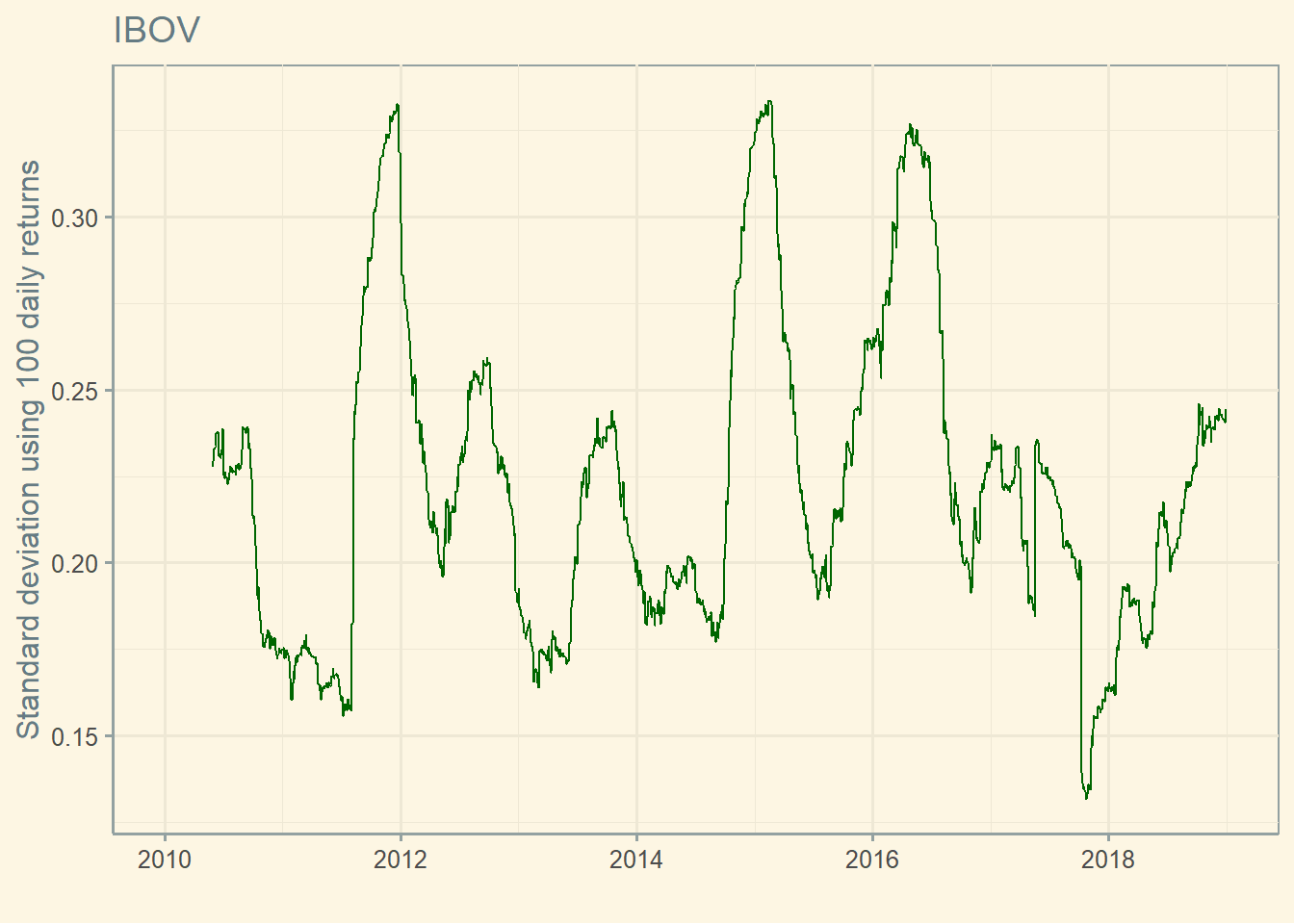
Standard deviation through time
$ sd <- roll_sd (ibov$ ret_closing_prices, width = 100 , min_obs = 100 ) * sqrt (250 )ggplot (ibov,aes (ref_date,sd))+ geom_line (color= '#006600' ) + labs (x = "" ,y= 'Standard deviation using 100 daily returns' , title= "IBOV" ) + theme_solarized ()
Insights stocks
Histogram two assets
See below that some stocks have heavier tails than others. The stock with the heavier tail is riskier.
<- c ('GOLL4.SA' , 'ITUB3.SA' ) <- '2012-01-01' <- Sys.Date () <- yf_get (tickers = stocks, first_date = start,last_date = end)<- data[complete.cases (data),] ggplot (data, aes (ret_closing_prices, fill = ticker)) + geom_histogram (bins = 100 , alpha = 0.35 , position= 'identity' ) + labs (x = "" ,y= 'Daily returns' , title= "Gol and Itub" ,subtitle = start)+ xlim (- 0.05 ,0.05 ) + theme_solarized ()
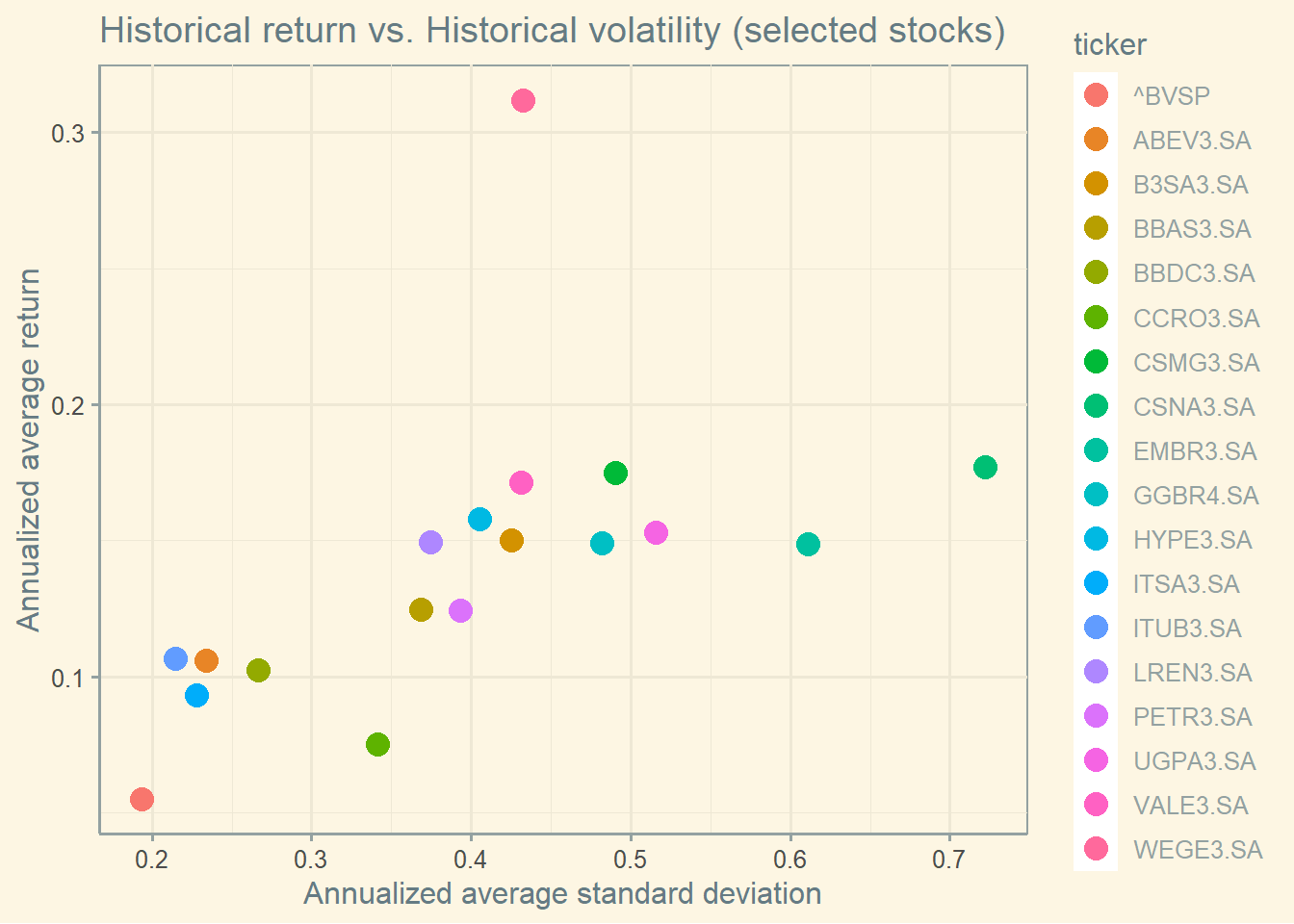
Tradeoff risk & return
There are always outliers for a particular time horizon. Also, Brazilian stocks have higher average standard deviation than Berk & Demarzo’s Figure 10.7.
<- c ('^BVSP' , 'ITUB3.SA' , 'WEGE3.SA' , 'PETR3.SA' , 'VALE3.SA' , 'ITSA3.SA' , 'BBDC3.SA' , 'BBAS3.SA' , 'ABEV3.SA' , 'GGBR4.SA' , 'LREN3.SA' , 'B3SA3.SA' , 'CSNA3.SA' , 'EMBR3.SA' , 'VIVO4.SA' , 'CCRO3.SA' , 'UGPA3.SA' , 'CSMG3.SA' , 'HYPE3.SA' ) <- '2010-01-01' <- '2023-01-01' <- yf_get (tickers = stocks, first_date = start,last_date = end,freq_data = "yearly" ,)<- data[complete.cases (data),] <- data %>% group_by (ticker) %>% summarise_at (vars (ret_adjusted_prices),list (mean = mean,sd = sd)) %>% as.data.frame ()ggplot (mean_sd, aes (x= sd, y= mean, color = ticker)) + geom_point (size = 4 ) + labs (x = "Annualized average standard deviation" ,y= 'Annualized average return' , title= "Historical return vs. Historical volatility (selected stocks)" ) + theme_solarized ()
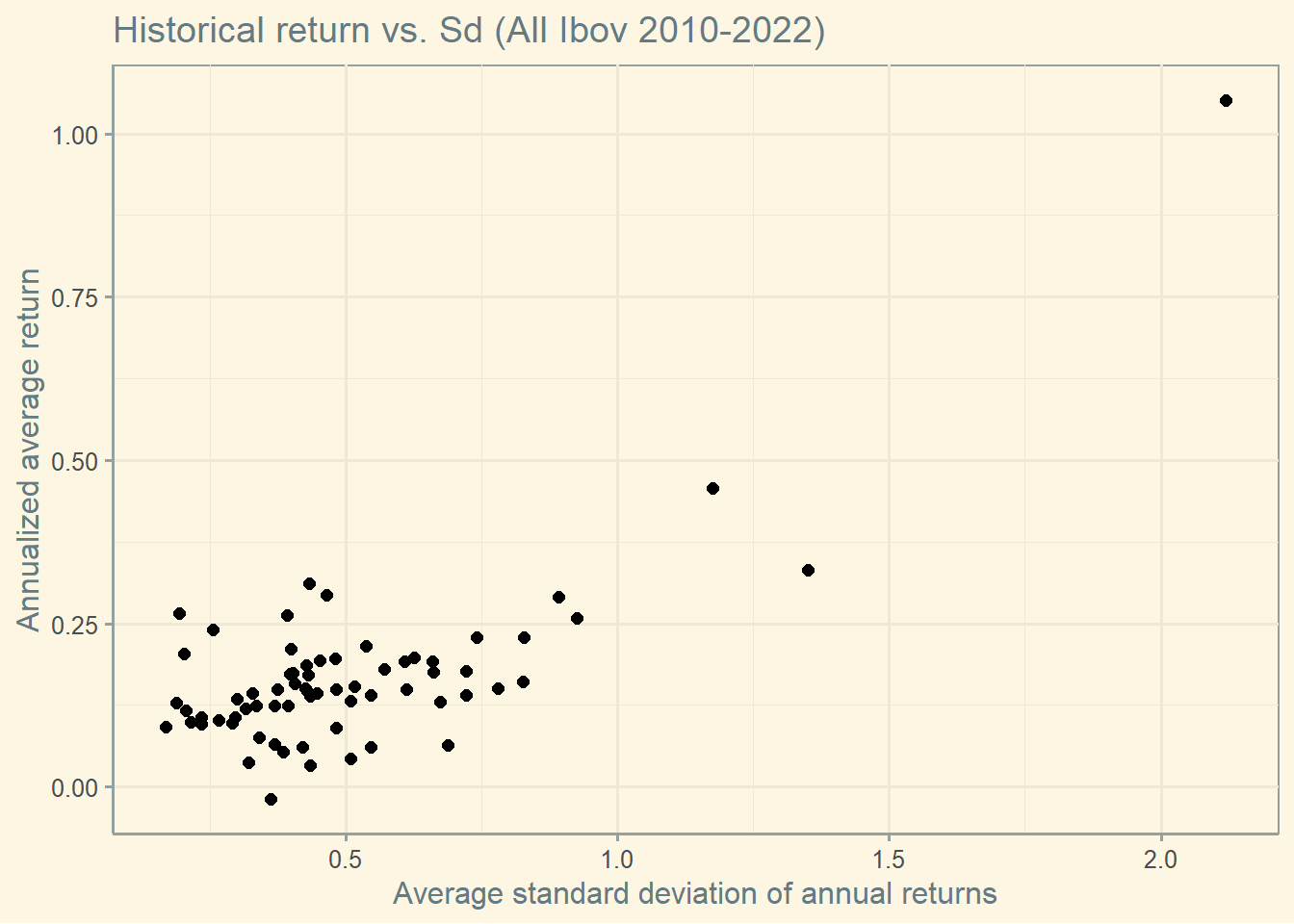
Tradeoff risk & return (Ibov)
<- '2010-01-01' <- '2023-01-01' <- yf_collection_get ("IBOV" , first_date = start,last_date = end,freq_data = "yearly" ,)<- data[complete.cases (data),] # Get mean & standard deviation by ticker <- data %>% group_by (ticker) %>% summarise_at (vars (ret_adjusted_prices),list (mean = mean,sd = sd)) %>% as.data.frame ()ggplot (mean_sd, aes (x= sd, y= mean)) + geom_point (size = 2 ) + labs (x = "Average standard deviation of annual returns" ,y= 'Annualized average return' , title= "Historical return vs. Sd (All Ibov 2010-2022)" ) + theme_solarized ()
Insights ESG
Tradeoff risk & return (by ESG level)
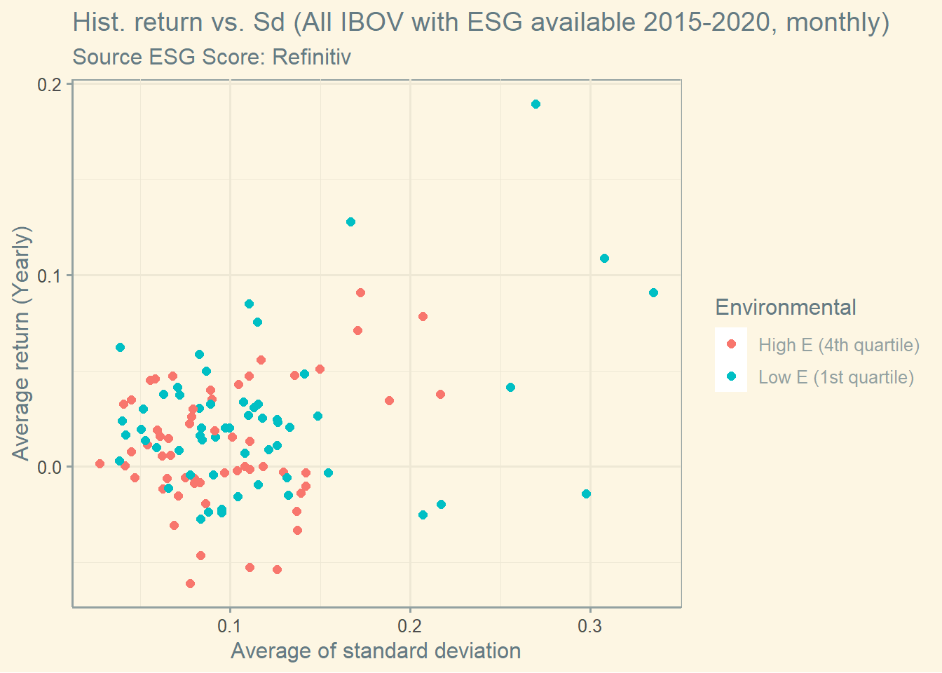
The graph below shows the trade-off risk and return by ESG score levels. I can’t see a clear pattern here.
Let’s exclude the intermediate group to see if there is a more clear pattern.
Let’s now create the same graph using only the E and the S pillars. Here you have the E Pillar.
Now you have the S Pillar.