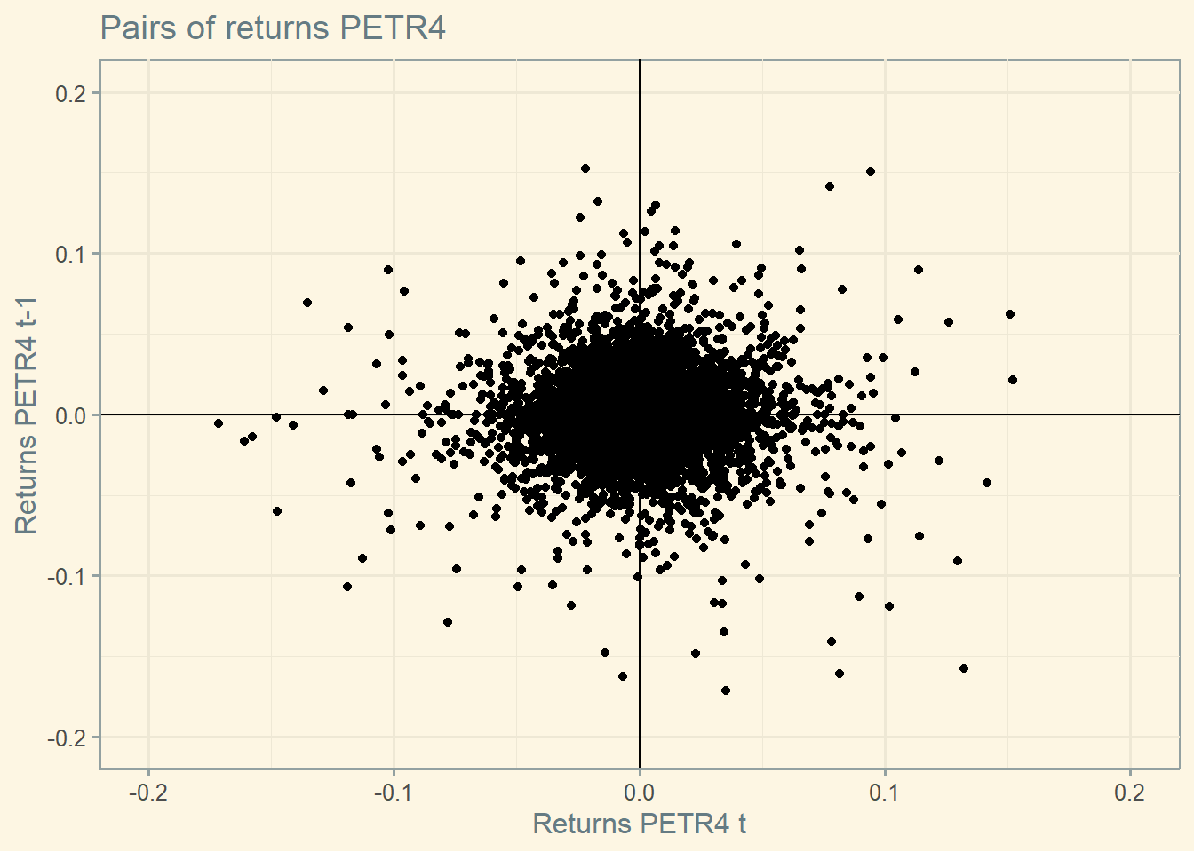
The graph below reproduces Figure 13.1 of BMA using data from Petrobras.
library(ggthemes)
library(yfR)
library(ggplot2)
library(dplyr)
library(tidyquant)
freq.data   <- 'daily'
start <-'2000-01-01'
end   <-Sys.Date()
asset <- yf_get(tickers = "PETR4.SA",
                        first_date = start,
                        last_date = end,
                        thresh_bad_data = 0.5,
                        freq_data = freq.data )
ret_asset <- asset   %>%tq_transmute(select = price_adjusted,
                                     mutate_fun = periodReturn,
                                     period = 'daily',
                                     col_rename = 'return',
                                     type = 'log')
ret_asset$lag <- lag(ret_asset$return)
ggplot(ret_asset, aes(x= return, y=lag)) +
  geom_point()+
  labs( y = "Returns PETR4 t-1", x="Returns PETR4 t",title = "Pairs of returns PETR4")+
  theme(plot.title = element_text(color="darkblue", size=15, face="bold"),
        panel.background = element_rect(fill = "grey95", colour = "grey95"),
        axis.title=element_text(size=12,face="bold"),
        title=element_text(size=10,face="bold", color="darkblue"),
        axis.text.y = element_text(face = "bold", color = "darkblue", size = 10),
        axis.text.x = element_text(face = "bold", color = "darkblue", size = 10))+
  xlim(-0.2, 0.2) + ylim(-0.2, 0.2)+
  geom_hline(yintercept = 0) +
  geom_vline(xintercept = 0) +   theme_solarized()