Here, you will find some examples of graphs.
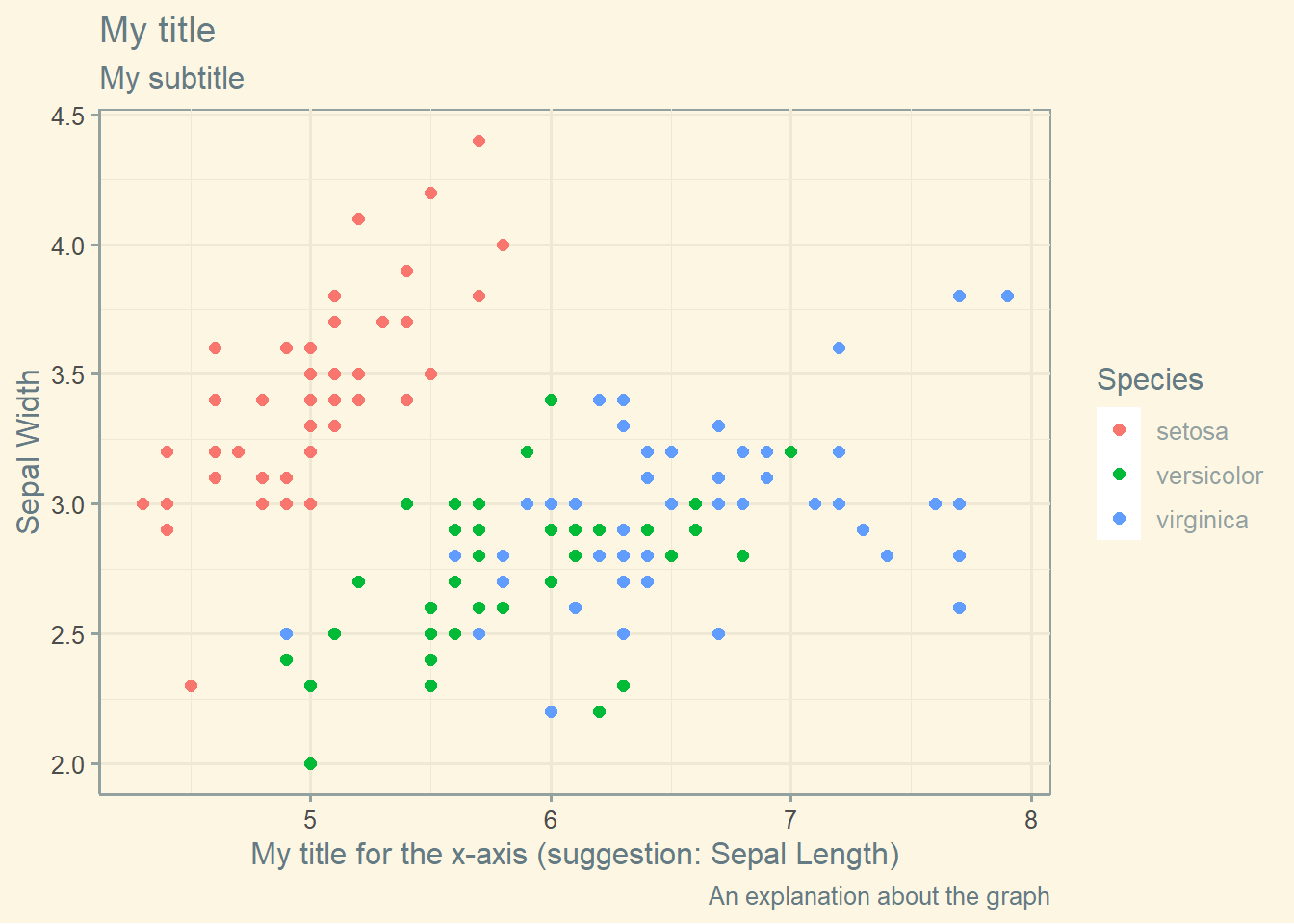
Scatterplot
library (ggplot2)library (ggthemes)<- iris ggplot (iris, aes (x= Sepal.Length, y= Sepal.Width, color= Species)) + geom_point (size = 2 ) + theme_solarized () + labs (title = "My title" ,subtitle = "My subtitle" ,caption = "An explanation about the graph" ,x = "My title for the x-axis (suggestion: Sepal Length)" ,y = "Sepal Width" )
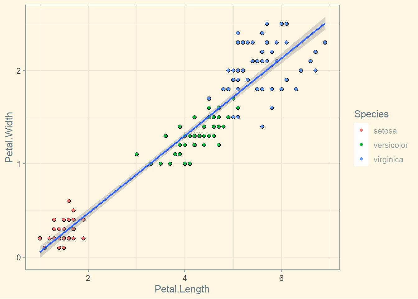
The same thing with a different pair of variables, but now I am including the linear relationship between the variables.
ggplot (iris, aes (x= Petal.Length, y= Petal.Width)) + geom_point (size = 2 ) + theme_solarized () + geom_point (aes (color = Species))+ geom_smooth (method= 'lm' )
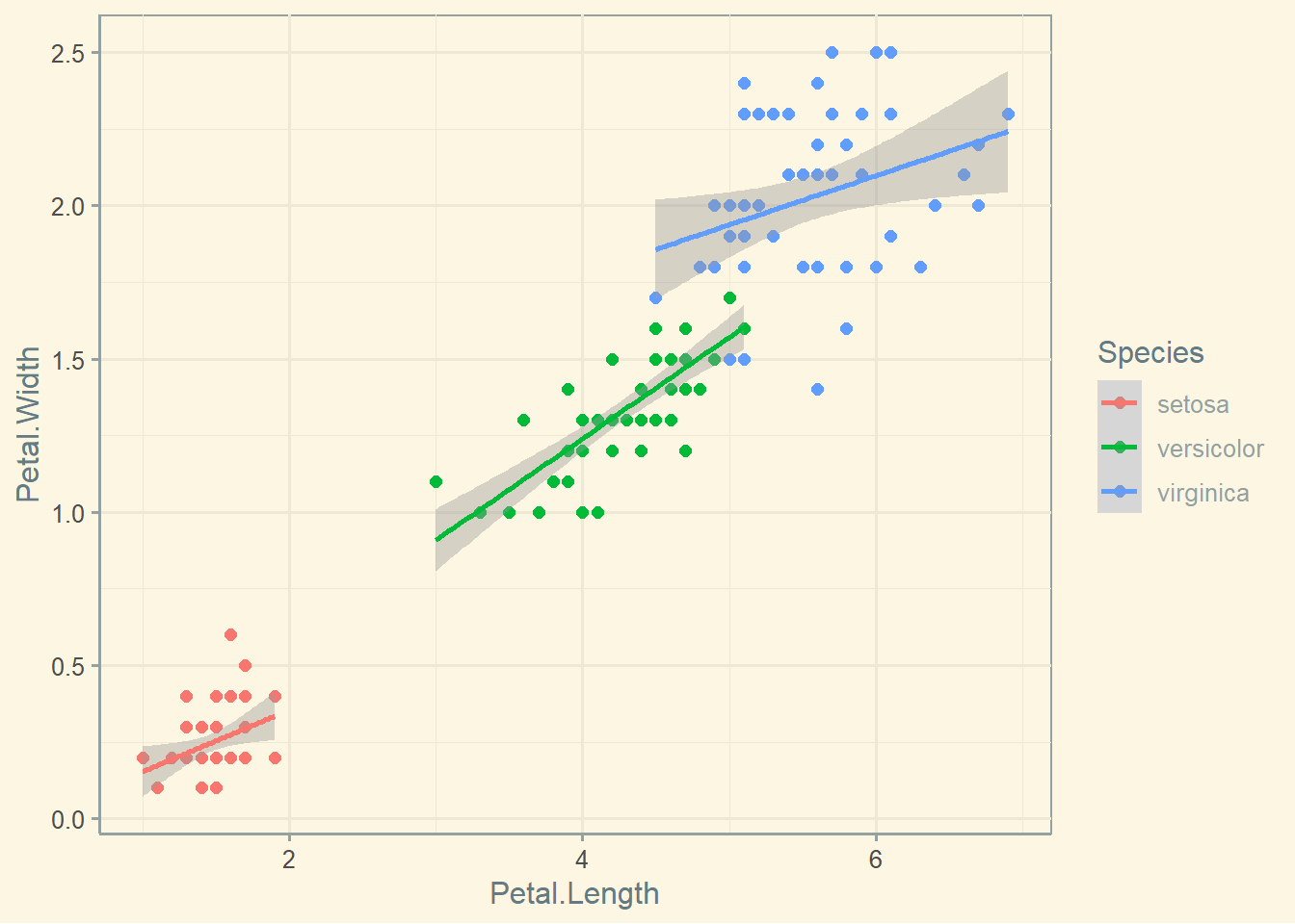
I could actually include a linear relationship by group. In all cases, we observe a positive relationship between the variables, but the relationship seens stonger in versicolor.
ggplot (iris, aes (x= Petal.Length, y= Petal.Width, color = Species)) + geom_point (size = 2 ) + theme_solarized () + geom_point (aes (color = Species))+ geom_smooth (method= 'lm' )
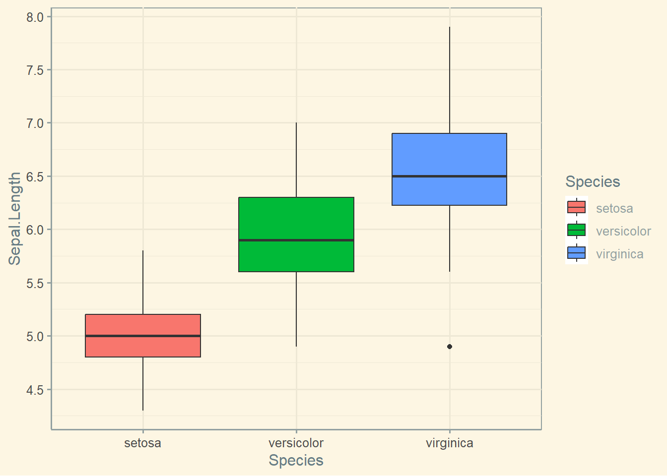
Boxplot
I could also create boxplots using the iris dataset. Notice there is one observation with very low Length in the virginica group.
ggplot (iris, aes (Species, Sepal.Length, fill= Species)) + geom_boxplot ()+ theme_solarized () + scale_y_continuous (breaks= seq (0 ,30 , by= .5 ))
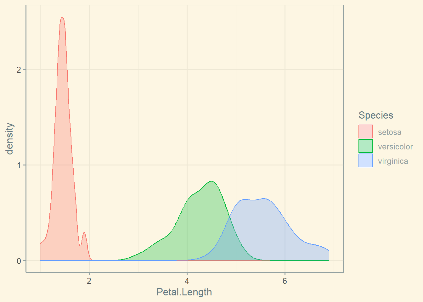
Density plots
Here is a nice-looking density plot.
ggplot (iris, aes (x= Petal.Length, colour= Species, fill= Species)) + geom_density (alpha= .3 ) + theme_solarized ()